BOWWE University
Where to use px, em, %, vh, vw? - CSS units explained
When building a site from scratch or from a template, you will quickly notice that most widgets in the BOWWE wizard have an auto unit assigned.
The BOWWE wizard allows you to use the functions of several units:
- vw - (viewport width)
- vh - (viewport height)
- px - pixels
- % - percentage
- em - relative font size
What are the differences and how do the different units work? You will find out in this tutorial!
PX - pixels
A pixel is the smallest uniform element displayed on the screen. We often use it in the context of resolution, for example, a Full HD display has 1920 pixels horizontally and 1080 vertically.
It is uniform, which means that when you specify the size of an object, it will take on a constant size regardless of the display or device you are using.
Best practices:
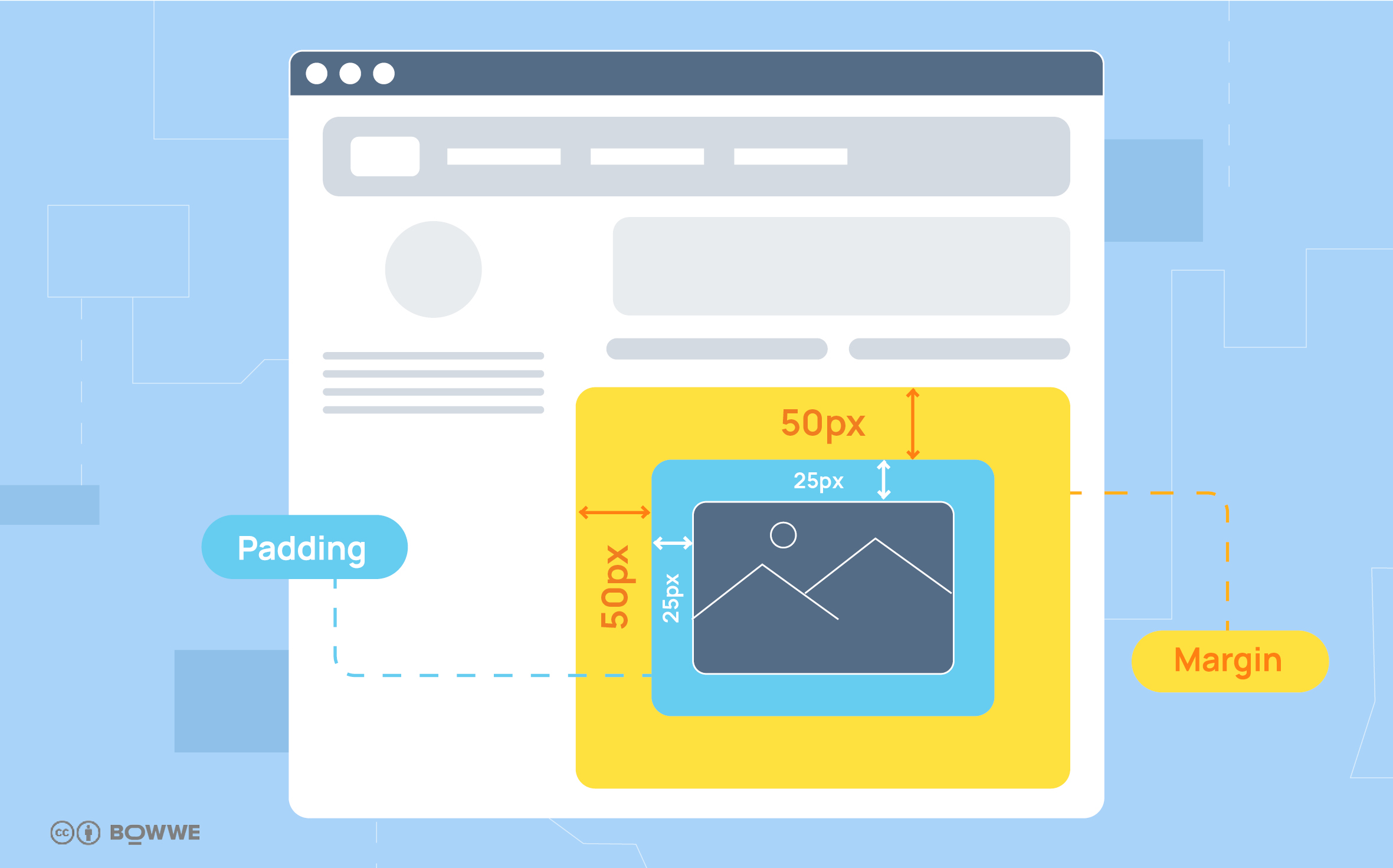
- Top and bottom padding and margin
- Images and icons (to avoid stretching them)
- Limit the maximum width of the text box

Remember about:
If the object's resolution is larger than the screen, it will not automatically fit, but may extend beyond the screen area. To avoid this, you can specify a maximum size in the Position tab, such as 100%.
Em
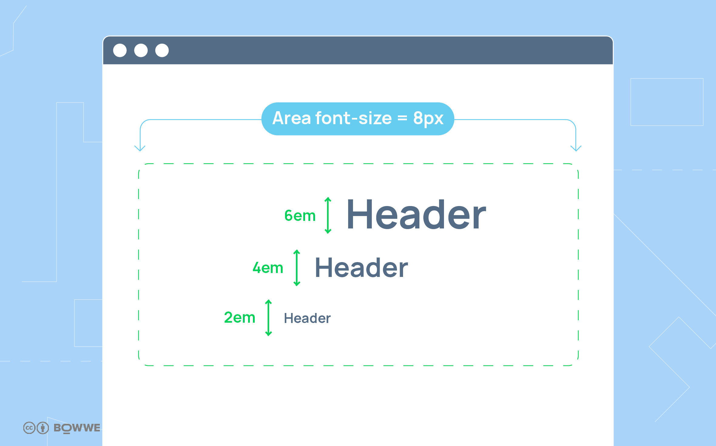
While pixels specify an absolute value, em is a relative (relative) unit that depends on the font size. It can be set in correlation to the size of the parent font, which gives you the ability to manipulate multiple sizes at once and will allow you to maintain proportion when editing the page. If you give an object a size em its value will be calculated based on the font size of the direct parent.
Best practices:
- Formatting text
- Creating menus
- Margin

% - percentages
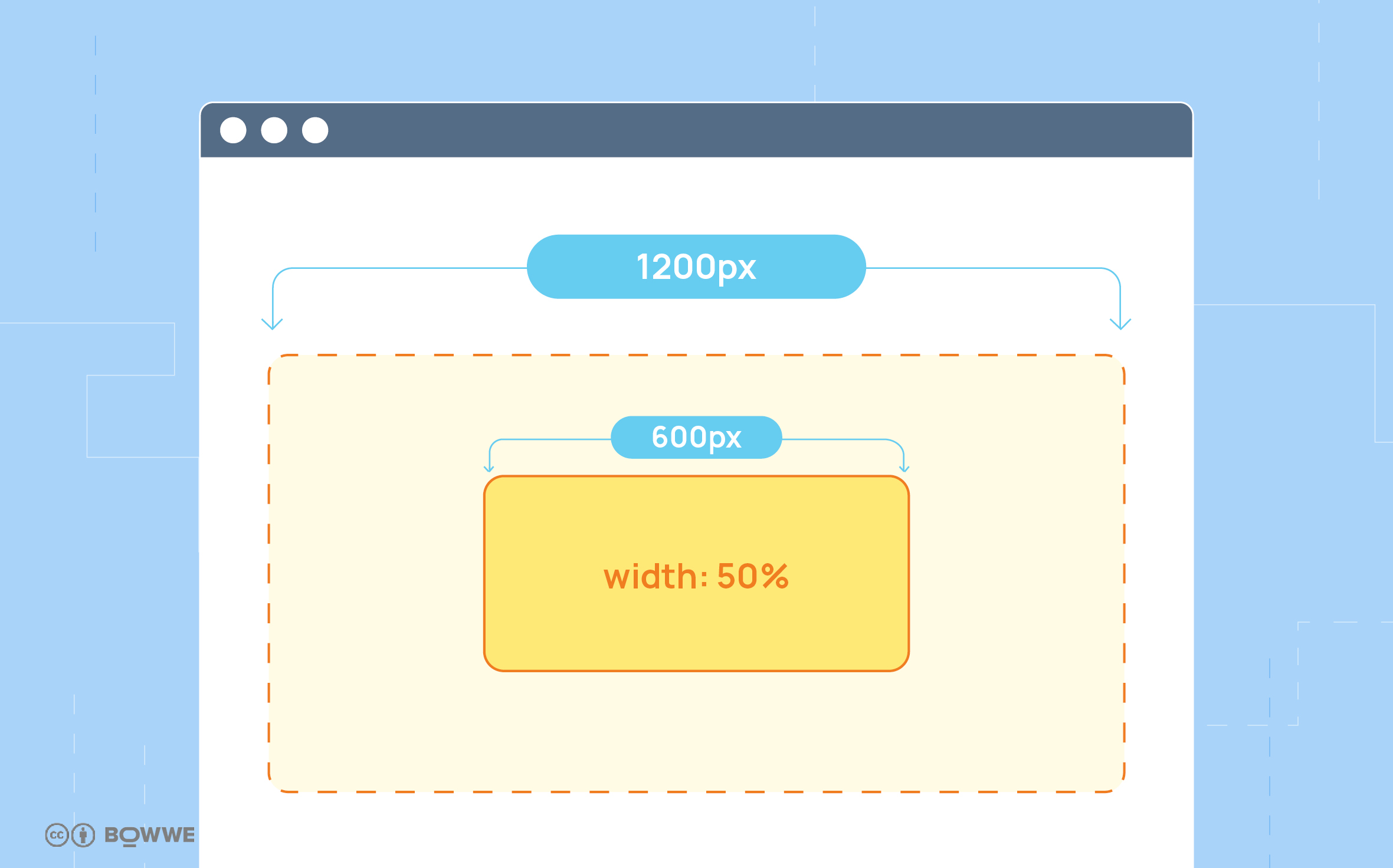
A percentage value is always specified relative to another value and usually refers to the property of the element's parent (that is, the container in which the element is located). Using this unit is useful if you want the layout of your page to smoothly adapt to a scaled screen, with objects adjusting their size.
Best practices:
- Side padding and margin
- Multimedia
- Objects and areas to occupy a certain portion of the page width/length

Remember about:
For images and icons, using the % unit can lead to a loss of quality when displayed on a high-resolution screen.
Viewport units
Viewport units are relative units that will allow you to have elements that are dynamically sized to fit the user's window. The main difference between % and viewport units is that they are not limited by the properties of the parent element.
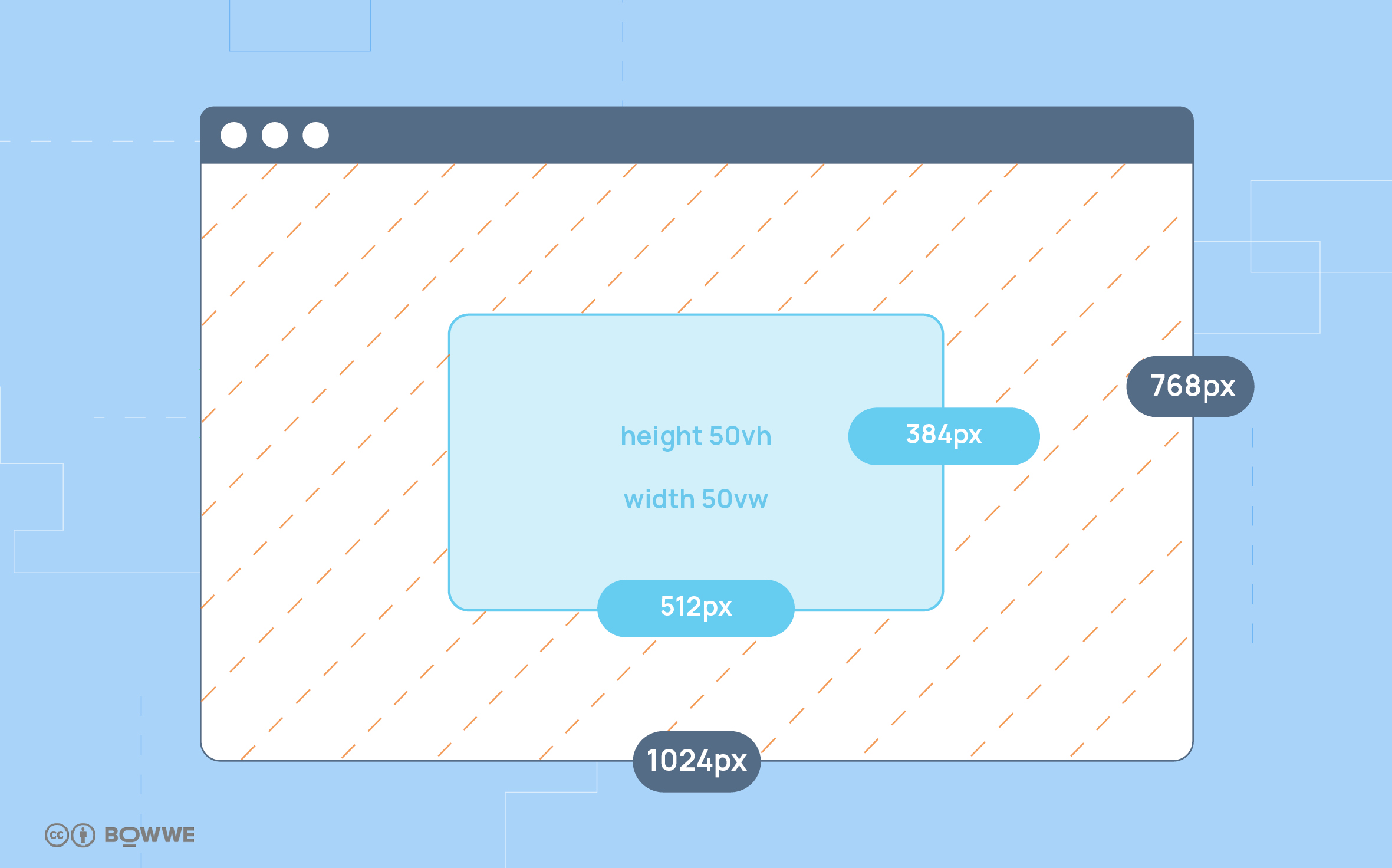
Vw - (viewport width) refers to the percentage width relative to the width of the browser window, while vh - (viewport height) refers to the height.
Best practices:
- Pop-ups
- Menu
- Photos
- Areas
Example:
An element with a size of 10 vh will occupy 10% of the window height.

Auto
You will also encounter the "auto" option in the wizard. It allows you to adjust the size of elements so that they display correctly in all conditions, and allows objects to adopt default values if you don't assign any others to them. It will also come in handy if you want to center elements on your page - just give the horizontal margins the value "auto"(margin-left: auto; margin-right: auto).
Fit-content
The "fit-content" option adjusts the size based on the content. In the case of an area, this means that it will take the maximum available space depending on the construction of its interior.
Congratulations!
Tip:
Check the view and responsiveness of your site with a simple tool built into the Google Chrome browser:
turn on Chrome and load your website,
use the right mouse button and select "Inspect" to open the developer tools,
find the "Toggle Device Toolbar" icon in the view or navigate to it by selecting "Ctrl+Shift+M",
explore the view of your site on different devices manually by adjusting the screen size or by selecting one of the basic devices available in the top bar of the window.


