BOWWE University
Widget Styles - how to edit elements in BOWWE?
In BOWWE you can use Widget Styles to style all the elements of your website. In this tutorial, you will learn all the necessary functions of widget styling.
How to open the Widget Styles?
1
2
3
4
What Widget Styles consist of?
Widget styles consist of four tabs. These are:
- Style
- Font
- Position
- Animations
These four tabs contain almost all the possibilities for editing the widget.
You can check the essential functions and settings of each tab below.
Widget Styles - basic settings
Style tab
Choose color
Let you choose a picture or graphic to be displayed in the background
Rotates the element the specified number of degrees °
Select the outer or inner shading of the element
Choose the color of the shading (usually black looks best)
Choose the angle at which you want the shadow to fall
Blurs shading
Sets the amount of shading
Font tab
Weight
Line height
Position tab
Width Min - Max
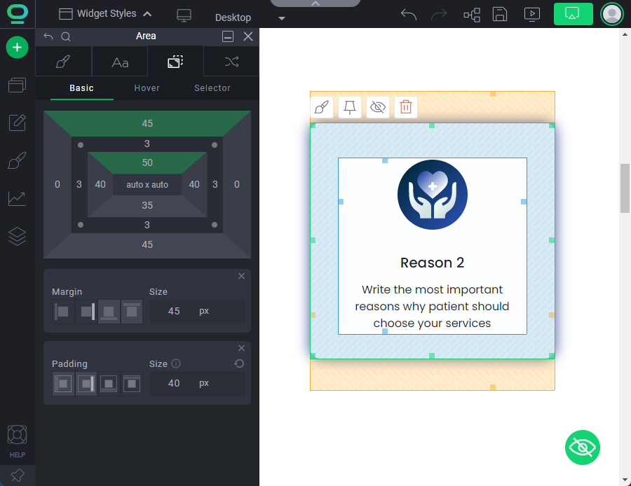
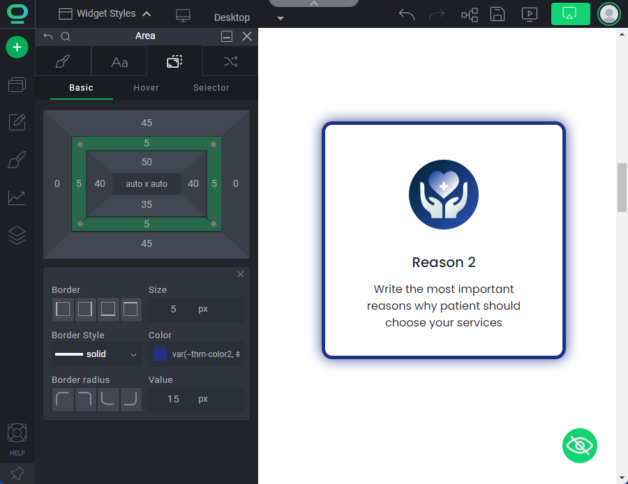
Widget graph
Widget graph lets you specify:
- Size
- Margin
- Padding
- Border
- Border-radius
- Outline


All-In-One Settings
All-In-One Settings is a shortened version of the Size and Position tab, which will allow you to quickly edit the most important settings for the element's position.
Width
Choose which side padding you are editing
Apply the padding size to all sides
Choose which side margin you are editing
Animations tab

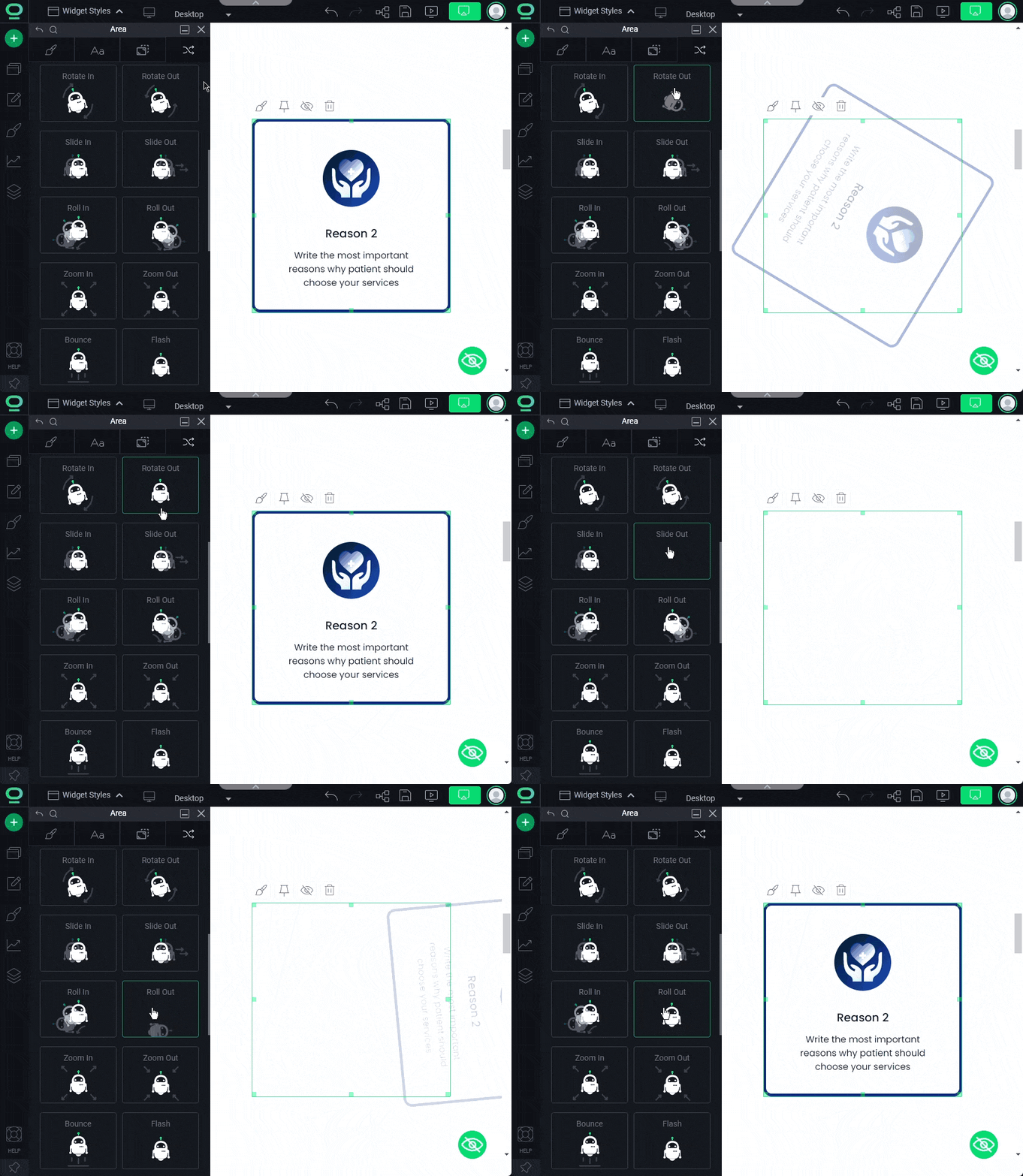
The animations tab allows you to choose at what point the element animation will be displayed for the visitor of your website. You can choose:
- On entry - the animation will be displayed immediately after entering the website
- On hover - the animation will be displayed when you hover the cursor over the element
- To exit - the animation will be displayed before closing the page
Then you can choose the specific type of animation you want to apply to the element.
Congratulations!
You know how to edit your website with Widget Styles!


